In an online voting platform, the final tally is only the tip of the iceberg. Beneath that single number — the total votes for each option — lies a living, breathing flow of activity. A well-designed data statistics feature can turn that hidden flow into a visible story, especially when it allows users to track hourly vote growth, break it down by individual options, and explore trends over custom date ranges through clear, interactive charts.
One platform that has embraced this idea is MiniVote. Known for its clean interface and robust analytics, MiniVote lets organizers and participants see exactly how votes evolve hour by hour. Whether you’re running a small community poll or a large-scale competition, its statistics dashboard makes the process transparent and engaging.
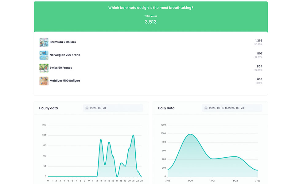
From Static Results to a Dynamic Timeline
Traditional voting results are static: you see the winner, the loser, and maybe the percentage split. But hourly vote tracking transforms this into a dynamic timeline. Instead of a single snapshot, you get a moving picture of how support builds, shifts, or stalls over time.
On MiniVote, this is more than just a table of numbers. The platform’s timeline view shows the rise and fall of each option’s support in real time, making it easy to spot key moments — like when a social media post drives a sudden surge.
Zooming in on Each Option’s Journey
It’s not just about total votes — it’s about how each choice performs over time. MiniVote’s per-option hourly breakdown lets you compare momentum directly. One option might start strong but plateau after the first day; another might lag early but gain steady support as word spreads.
For campaigners, event organizers, or even classroom competitions, this insight is invaluable. It helps identify which messages or outreach efforts are working and when they’re having the most impact.
The Power of Date Range Selection
Hourly tracking becomes even more powerful when paired with flexible date range selection. MiniVote allows users to zoom in on specific windows — a single day, a weekend, or the final 48 hours — and instantly see the corresponding vote curves.
This flexibility allows for targeted analysis:
- Reviewing only the first 24 hours to measure the impact of a launch announcement.
- Comparing weekdays to weekends to see when voters are most active.
- Analyzing the final push before the deadline to understand last-minute behavior.
Visualizing Trends Through Curves
Numbers in a table can be informative, but a curve on a chart can be transformative. MiniVote’s interactive line graphs make trends instantly visible: the steep climbs, the flat stretches, the sudden jumps. When you can overlay multiple options on the same chart, the story becomes even richer.
For many users, this visual layer is what turns raw data into actionable insight. It’s the difference between reading a list of times and seeing the race unfold in front of you.
Why This Matters Beyond Curiosity
Some might see hourly vote tracking as a novelty, but its value runs deeper. For organizers, it’s a tool for transparency — showing that the process is open and that no suspicious surges go unnoticed. For participants, it’s a way to feel connected to the evolving outcome, to see their contribution as part of a larger movement.
MiniVote’s approach makes this transparency effortless. By combining detailed analytics with an intuitive interface, it ensures that both organizers and voters can trust the process.
A Living Record of Engagement
Ultimately, an online voting platform with robust hourly tracking, per-option breakdowns, date range filters, and clear visualizations doesn’t just record votes — it records engagement. MiniVote captures the rhythm of participation, the moments of excitement, and the shifts in momentum that define the life of a vote.
When you can see not just what people chose, but when and how they chose it, the numbers stop being static. They become a story — one that unfolds hour by hour, and one that you can revisit, analyze, and learn from long after the voting ends.