Trends in interior design move in cycles. One year a color feels fresh and exciting, and the next it suddenly looks like a relic from a very specific moment in time. Paint is one of the easiest ways to transform a room, but it’s also one of the easiest ways to date a space if you choose a shade that burns bright and fades fast. While there’s nothing wrong with following your personal taste, it’s worth knowing which colors tend to fall out of favor quickly — especially if you’re planning to sell your home or simply want a look that ages gracefully.
Below are ten paint colors that have a reputation for going out of style faster than others, along with the reasons they lose their appeal and what you might consider instead.
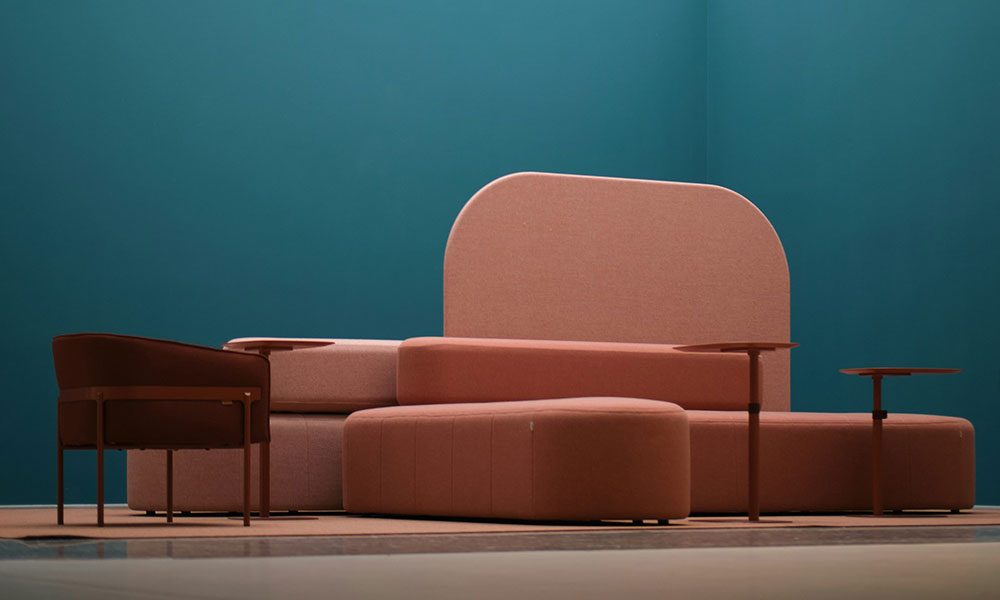
1. Millennial Pink
For a few years, this soft blush shade was everywhere — cafés, bedrooms, product packaging, even restaurant interiors. It was charming, playful, and instantly recognizable. But that’s exactly the problem. When a color becomes tied to a cultural moment, it rarely survives the next trend cycle. Today, millennial pink often feels like a timestamp rather than a timeless choice. It’s not that the color is “bad”; it’s simply over-associated with a specific era.
2. Cool Gray
Cool gray once dominated modern homes. It was the go‑to neutral for nearly a decade, praised for its clean, minimalist vibe. But as design shifted toward warmth and comfort, cool gray began to feel stark and even a little gloomy. Its blue undertones can make a room feel cold, especially in natural light. Many homeowners now prefer warmer neutrals that feel more inviting and less industrial.
3. Bright Turquoise
Vibrant turquoise has a way of grabbing attention — sometimes too much of it. It’s bold, energetic, and fun, but it’s also a color people tend to tire of quickly. Because it’s so saturated, it limits your décor options and can overwhelm a space if used on large surfaces. It often works better as an accent rather than a full‑room commitment.
4. Mustard Yellow
Mustard yellow has had several comebacks, usually tied to retro‑inspired design. But it’s a tricky shade to get right. Too dark, and it feels heavy; too bright, and it becomes overpowering. It also clashes with many modern materials and finishes. As a result, it tends to fade out of style as quickly as it returns.
5. Dark Chocolate Brown
Deep brown walls were once considered luxurious and dramatic. Today, they often feel dated and overly heavy. Dark brown absorbs light, making rooms feel smaller and more closed‑in. With the current preference for airy, open spaces, this color rarely finds a place in contemporary design unless used very sparingly.
6. Yellow‑Beige
If you’ve ever walked into a home built in the early 2000s, you’ve probably seen this shade. Yellow‑beige was once the default neutral, but it now reads as tired and old‑fashioned. It doesn’t pair well with modern flooring, cabinetry, or furniture, and it tends to cast a dull, muddy tone across a room. Warm neutrals are back, but this particular version didn’t make the cut.
7. Lime Green
Lime green is lively and youthful, but it’s also one of the fastest colors to fall out of favor. It’s difficult to decorate around, and it can feel chaotic in large doses. While it works well in playful spaces like kids’ rooms, it rarely stands the test of time in living rooms, kitchens, or bedrooms.
8. Burgundy
Burgundy walls had a moment in traditional and formal interiors, but that moment has largely passed. The color can feel heavy and overly dramatic, especially in smaller spaces. It also clashes with the lighter, more natural palettes that dominate today’s design trends. Burgundy still has a place in classic décor, but it’s no longer a mainstream choice.
9. Pure White
This one might surprise you. Pure, stark white — the kind with no warmth at all — can actually date a room faster than you’d expect. While white is often considered timeless, ultra‑bright whites can feel sterile and harsh. They show every scuff, shadow, and imperfection. As warmer, softer whites take over, pure white is slowly losing its appeal.
10. Pastel Purple
Lavender and other pastel purples tend to be associated with children’s rooms or specific trend waves. They rarely transition well into adult spaces, and they’re difficult to pair with modern furniture and décor. Because of that, they often feel outdated within just a few years.
Why These Colors Fall Out of Style
Most of these shades share a few common traits:
- They’re tied to a specific cultural moment
- They’re difficult to pair with furniture and décor
- They create strong emotional reactions
- They don’t adapt well to changing trends
- They can overwhelm a space when used in large areas
In other words, they’re memorable — sometimes too memorable.
Timeless Alternatives
If you want a color that will still look good five or ten years from now, consider:
- Soft warm whites
- Muted greens
- Earthy taupes
- Warm grays (greige)
- Gentle blues
- Natural clay tones
These shades have staying power because they’re versatile, calming, and easy to style.
Which Paint Color Do You Think Goes Out of Style the Fastest?